Fusion 2.0:A Component- Led Design System Evolution
2024-25
Contributed to the evolution of Fusion into a scalable, component-led design system by working on core component creation, guidelines, stress testing, VQA, and designer enablement. Helped reduce component detachment and improve consistency across design and development through structured processes and hands-on collaboration.
Agency
Wells Fargo, Bangalore
Tools
Figma
KitchenSync Application
My Role
Research, Design system
Designing the Design System That Designs Better
An evolution of Fusion, reimagined to design better as the product, tools, and teams evolved.

Understanding Fusion
Fusion is Wells Fargo’s design system for native applications.
It enables design and development teams to build consistent, scalable product experiences.
-
Native applications: Powered by Fusion
-
Responsive platforms: Supported by a separate design system
What Fusion 1.0 Offered
A library of UI components Usage guidelines for designers Developer-ready resources for implementation.
Why Fusion Needed to Evolve
-
The Detachment Problem
Components detached not by choice but by necessity, due to missing properties, limited flexibility, and an inability to adapt to real design needs. This turned detachment into a signal rather than a mistake. Detachment became a signal - not a mistake.
-
Components That Didn’t Scale
Components didn't scale effectively, built for limited scenarios that failed to support all real-world requirements. Designers needed variations the system couldn't provide, leading to workarounds instead of true reuse.
-
A Changing Product Experience
The product experience evolved with more minimal layouts, softer visuals featuring rounded corners, and clearer hierarchy with bolder information.
-
Tools Advanced, Systems Stalled
Tooling advanced rapidly with Figma's powerful component structures, variants, booleans, and flexible properties enabling simpler, more scalable builds.
My Role in Fusion 2.0
I worked on Fusion 2.0 across the full lifecycle of components from creation and validation to documentation and adoption.
My focus areas included :
-
Building scalable, requirement-ready components
-
Creating clear, reusable guidelines
-
Stress testing and VQA (Visual Quality Assurance) of developed components
-
Training designers on newly launched components and their correct usage
Component Creation
Fusion 2.0 didn’t begin with a full system rewrite.
We started by improving the components designers used most often.
I worked on rebuilding these components one by one, using real design requirements to guide their structure, properties, and flexibility.
To illustrate this component-led approach, let’s focus on the Progress Bar, a commonly used component, and walk through how it evolved from audit to final implementation.
What is a Progress Bar ?
A progress bar visually represents the completion status of a task or process, helping users quickly understand how far along they are.
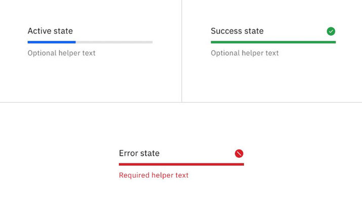
Single Progress Bar - Displays a continuous value from 0% to 100%.
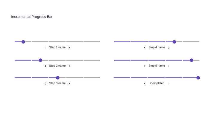
Incremental Progress Bar - Divided into a maximum of five steps, allowing users to choose the step count as needed.

Usability & Current Component Audit
To evaluate the existing progress bar, we explored its real-world usage across different user journeys. This involved: Scenario Mapping, Designer Discussions, Component Audit.
Component Audit - Reviewing how the progress bar performs in various features, including its behavior on responsive layouts and across devices.

Scenario Mapping - Identifying all contexts where the progress bar appears, from short tasks to multi-step flows.

Designer Discussions - Engaging with fellow designers to understand requirements, pain points, and potential enhancements.

Data Collection & Discovery
A thorough competitive analysis was conducted to understand how progress bars are implemented across domains and design systems.
Data Collection & Discovery
A thorough competitive analysis was conducted to understand how progress bars are implemented across domains and design systems.
Cross-Domain Research - Exploring banking, e-commerce, productivity, and other sectors to see how progress bars adapt to different user needs, complexity levels, and task lengths.

Practical Testing - Trying out multiple applications (both familiar and new), capturing screenshots to document patterns, styles, and interaction behaviors.


Design System Benchmarking - Studying multiple design systems to review specifications, guidelines, states, and accessibility notes provided for progress bars.


Best-in-Class Research - Identifying the most effective design and interaction choices based on findings from previous user scenarios and usability audits.
Key Insights Extraction - Summarizing common strengths, differentiators, and opportunities for improvement that could be implemented in our own component.

Existing Component Audit -II
Functional & Visual Analysis - Revisited the component after data collection to analyze how it works across scenarios. Compared it with similar components, checked behavior on responsive screens, and validated key features like value range flexibility (0–10 increments). Reviewed layout, typography, spacing, and states to ensure consistency. Noted how text, progress fill, and variants were displayed across themes.
Opportunities Identified - Recognized strengths such as ease of adjusting progress values, and gaps like missing target indicators, limited color options, and room for richer interaction states.

Building :
Defining Component Properties
In this phase, I defined and documented the full set of component properties—such as size, color, states, variants, and interaction patterns—ensuring designers and developers could use them consistently. For accessibility, I incorporated considerations like contrast, keyboard navigation, and screen reader support.

Explorations
Sketched and tested multiple design options in Figma, exploring strokes, colors, and states. Organized variant combinations for clarity and refined them through continuous feedback from the design leader.

Component Structuring & Build
Defined scalable properties and variants covering single and incremental progress bars, multiple states, and flexible width with fixed height. Built modular elements (title, labels, target indicator, support text) to prevent detachment, validated across existing user cases, and refined through continuous feedback and staged leadership reviews before final approval.


Stress Testing
Can this component break?
Stress testing was conducted during and immediately after component creation to validate robustness across real design scenarios.
Approach
Once a component was built, it was shared with multiple designers for active use across different screens and requirements. Testing happened across varied use cases, helping surface edge cases, misuse patterns, and scalability issues early.
Feedback & Iteration
Findings were discussed directly with designers through focused syncs and reviews. Identified issues were documented and fed back into the component, enabling continuous refinement before wider adoption.
Visual Quality Assurance
Does this component meet system quality standards?
VQA ensured that developed components aligned with design intent, system standards, and platform expectations.
Approach
VQA was performed post-development using the KitchenSync application, a dedicated testing app for Fusion 1.0 and Fusion 2.0 components, available on both Android and iOS. Components were tested across parameters such as states, variants, typography, spacing, color tokens, and interactions.
All visual and functional discrepancies were systematically documented and shared with the development team. Once fixes or refinements were implemented, components were revalidated to ensure issues were fully resolved before release.

Guidelines Creation
A component is only successful when it can be understood and used consistently.
Alongside building components, I focused on creating a clear and scalable documentation system to support adoption.
Guidelines Template Revamp
I was part of the core team responsible for revamping the Fusion guidelines framework.
Working closely with the Design Lead and Content Head from the US team, I helped define a standardized, scalable template that could be applied across all components.
Component Guidelines Structure
Each component is supported with clear, structured guidelines to ensure correct and consistent usage.
-
Cover Image - Primary visual reference of the component
-
Component Overview - What the component is and when to use it
-
Anatomy - Breakdown of all component parts
-
Tap Targets - Interactive areas and touch guidelines
-
Best Practices - Recommended usage within screens and flows
-
Variants - All supported types, states, versions, and step configurations
-
In Figma - How to use and customize the component using properties and variants
-
Properties & Color Tokens - Component properties and linked color tokens (Developer-ready reference)
-
Accessibility - Behavior at 200% text zoom and accessibility considerations
-
What’s New - Key updates, improvements, and version changes
Training
Conducted in-person training sessions for the India Design Team and India XT Team to support adoption of Fusion 2.0 components.
Training Approach
-
Walkthrough of updated guidelines and recent component changes
-
Explanation of new properties, variants, and usage patterns
-
Quick, task-based exercises for hands-on learning
Bonus - Indirect Stress Testing
Group usage during training naturally revealed edge cases and usability gaps, which were fed back into component improvements.

Impact
-
Reduced Component Detachment
Re-released Fusion 2.0 components saw a noticeable reduction in instance detachment, as most design needs were addressed through well-defined variants and properties rather than local overrides.
-
Clearer, More Structured Guidelines
The revamped guidelines introduced a more consistent and structured format, making it easier for designers to understand component anatomy, usage, properties, and edge cases from multiple perspectives.
-
A Changing Product Experience
The product experience evolved with more minimal layouts, softer visuals featuring rounded corners, and clearer hierarchy with bolder information.
-
Tools Advanced, Systems Stalled
Tooling advanced rapidly with Figma's powerful component structures, variants, booleans, and flexible properties enabling simpler, more scalable builds.


